
Challenge
Imagine... Due to client confidentiality, you can't share all the projects you have been working on.
Solution
That's how I built my brand and developed its UI kit based on previous experience.
Tools
Figma
Focus
Component library
Variables
Semantic tokens
Accessibility
Documentation
1. Logo
I named my brand "Imagine" (a) and defined five key UX screens to create their corresponding components. I also adapted the logotype to align with them (b).
(a) logo WIP


(b) logotype variants
2. Grayscale Drafts
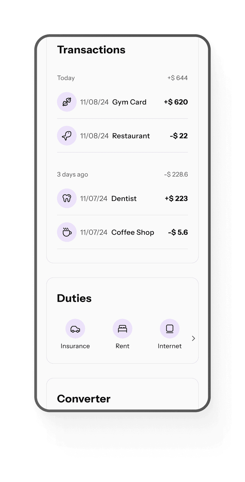
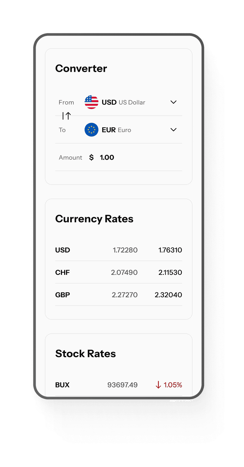
I started designing component sets in grayscale to create a clear hierarchy. The dashboard was my initial screen, as it is complex and contains many common components.
1
1
1
1
Mo
Mo
Mo
Su
Mo
Tu
We
Th
Fr
Sa
January
January
January
January
2025
2025
2025
2025
29
30
31
1
2
3
4
5
6
7
8
9
10
11
12
13
14
15
16
17
18
19
20
21
22
23
24
25
26
27
28
29
30
31
1
evolution of the calendar component
3. Typography Scale
While doing so, I also adjusted my typography scale and created variable collection with font-family, font-size, font-weight, font-line-height.
Eyebrow
H 1
H 2
P
GREAT DEAL
New Loyal Program
Explore the benefits for you
Read more
4. Grid System
The dashboard started to take shape by following parameters:
grid:
8-point
columns:
12
margin:
32 px
gutter:
32 px
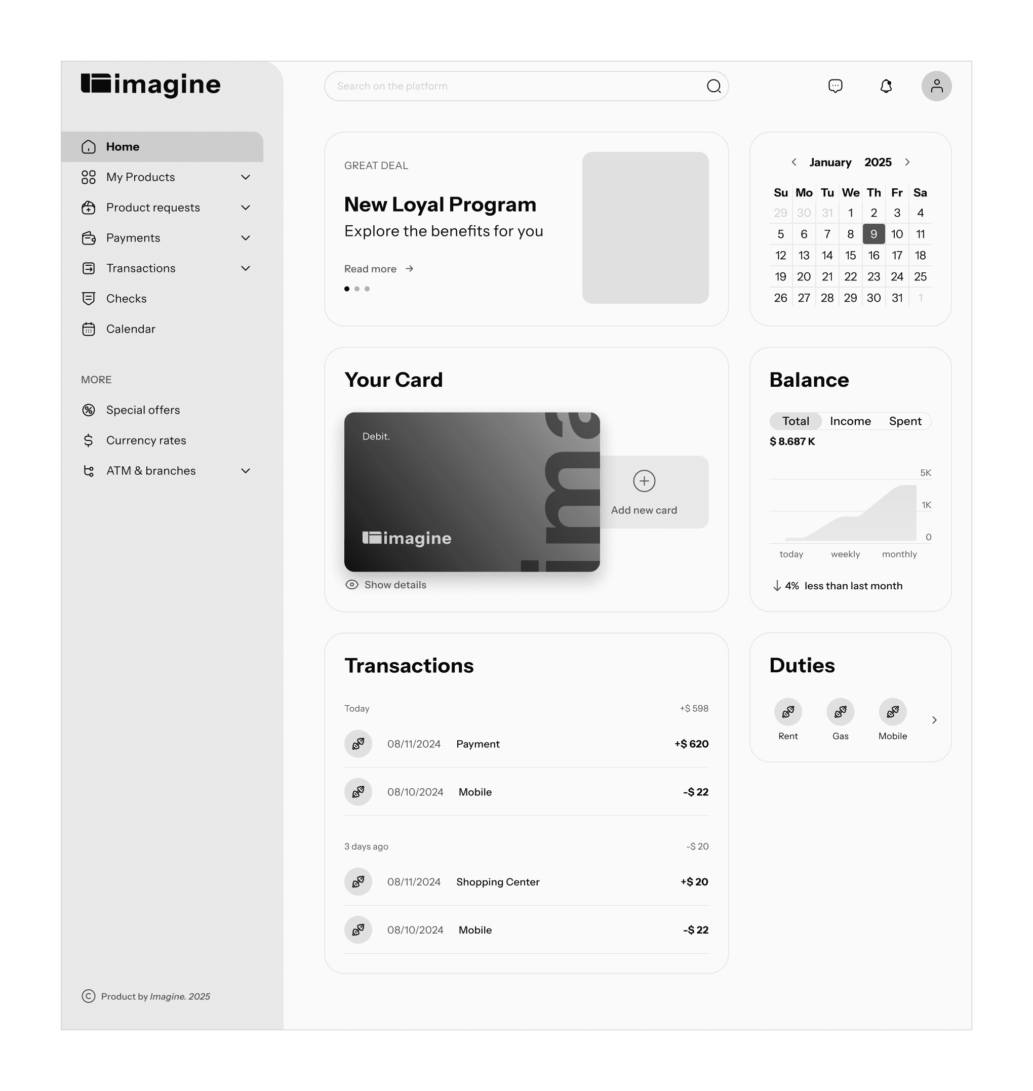
5. Color Variables
Having a clear hierarchy based on neutrals, I added my primary and colors.
The semantic color tokens follow the structure:
component-category-state
6. Colorful Layout


7. Next Steps
I continually improve the design kit by adapting it for additional projects. Current state: