Header Image

TABLE

Row by Row


Header Image

TABLE

Row by Row


Overview

Imagine… A development team hires you to redesign the initial UI of their start-up for managing client documentation.

Challenge

It was created using premade components, resulting in inconsistency, a monotonous aesthetic look, and numerous navigation issues. Here is what I undertook.

Focus

Style guide

Functionality

Navigation

Visual hierarchy

Buttons

Component variants

Statuses

Tools

Figma

1. Style Guide

I introduced a secondary color to enhance the visual dynamic.

primary 80

HSL: 263 87 50

O: 100

secondary 80

HSL: 163 87 50

O: 100

By using it, I developed a button component set designed to perform various actions.
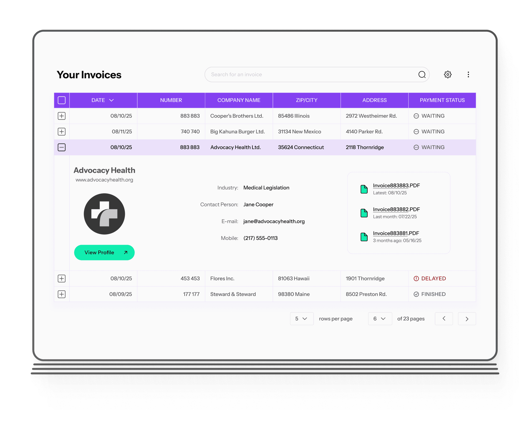
primary + icon

Call-to-Action

default

primary + icon

Call-to-Action

default

primary + icon

Call-to-Action

default

secondary

Call-to-Action

secondary

Call-to-Action

button component: primary and secondary variants

button component: primary variants

2. Table Items

To enable easy scanning, I have set a sufficient row height and column width for users to scan, compare, or edit the table effectively.

48 px

Row Item Text

table row: item

Since green was the secondary color, I used blue to indicate positive status messages.

positive

FINISHED

positive

FINISHED

positive

FINISHED

negative

DELAYED

negative

DELAYED

negative

DELAYED

table row: status

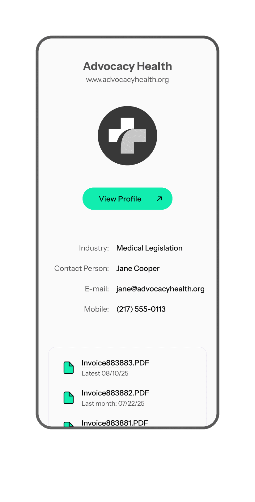
I indicated hover and selected (open) row states to enhance the user experience.

default, closed, show details

12/08/25

85695633

Advocacy Health Ltd.

1540 Sofia

1 Brussels Blvd.

STATUS

default, closed, show details

12/08/25

85695633

Advocacy Health Ltd.

1540 Sofia

1 Brussels Blvd.

STATUS

default, closed, show details

12/08/25

85695633

Advocacy Health Ltd.

1540 Sofia

1 Brussels Blvd.

STATUS

default, closed, show details

12/08/25

85695633

Advocacy Health Ltd.

1540 Sofia

1 Brussels Blvd.

STATUS

table row: states

3. Visual Hierarchy

I styled the table for better scannability and established a visual hierarchy based on colors. I enhanced the visibility of headers so that the labels stand out from the rest of the content.

date

number

company name

ZIP/CITY

CONTACT INFO

PAYMENT STATUS

date

number

company name

ZIP/CITY

CONTACT INFO

PAYMENT STATUS

date

number

company name

ZIP/CITY

CONTACT INFO

PAYMENT STATUS

table header

4. Functionality

I enhanced the table's functionality by adding:


- a sorting-by-date option


- a toolbar positioned above the table, with a search bar and an inline menu that offers additional options:

Your Invoices

|

Search for an invoice

Search

toolbar above the table

5. Navigation

I simplified the top navigation by reducing the number of menu items:

Clients

Contracts

Invoices

top navigation

I implemented pagination to break the table into more manageable sections, which also includes a rows-per-page control.

5

rows per page

6

of 23 pages

pagination

6. Final Table

Table Mockup
Table Mockup
Table Mockup
Table Mockup
Phone Screen -  2
Phone Screen -  2
Phone Screen -  2
Phone Screen -  2

7. Next Steps

Due to changed priorities, the project is currently on hold.

Imagine: More Projects

Header Image

Sing Up/In:

Screen by Screen

Focused on Accessibility

Imagine, 2025

Header Image

Sing Up/In:

Screen by Screen

Focused on Accessibility

Imagine, 2025

Header Image

Sing Up/In:

Screen by Screen

Focused on Accessibility

Header Image

Sing Up/In:

Screen by Screen

Focused on Accessibility

Header Image

Product List:

Filter by Filter

Focused on Usability

Imagine, 2025

Header Image

Product List:

Filter by Filter

Focused on Usability

Imagine, 2025

Header Image

Product List:

Filter by Filter

Focused on Usability

Header Image

Product List:

Filter by Filter

Focused on Usability

Header Image

Checkout:

Step by Step

Based on E-Commerce Experience

Imagine, 2025

Header Image

Checkout:

Step by Step

Based on E-Commerce Experience

Imagine, 2025

Header Image

Checkout:

Step by Step

Based on E-Commerce Experience

Header Image

Checkout:

Step by Step

Based on E-Commerce Experience

Header Image

UI Kit:

Atom by Atom

How I Designed My Brand Components

Imagine, 2025

Header Image

UI Kit:

Atom by Atom

How I Designed My Brand Components

Imagine, 2025

Header Image

UI Kit:

Atom by Atom

How I Designed My Components

Header Image

UI Kit:

Atom by Atom

How I Designed My Brand Components

0

0

0

0

0

0

0

0