
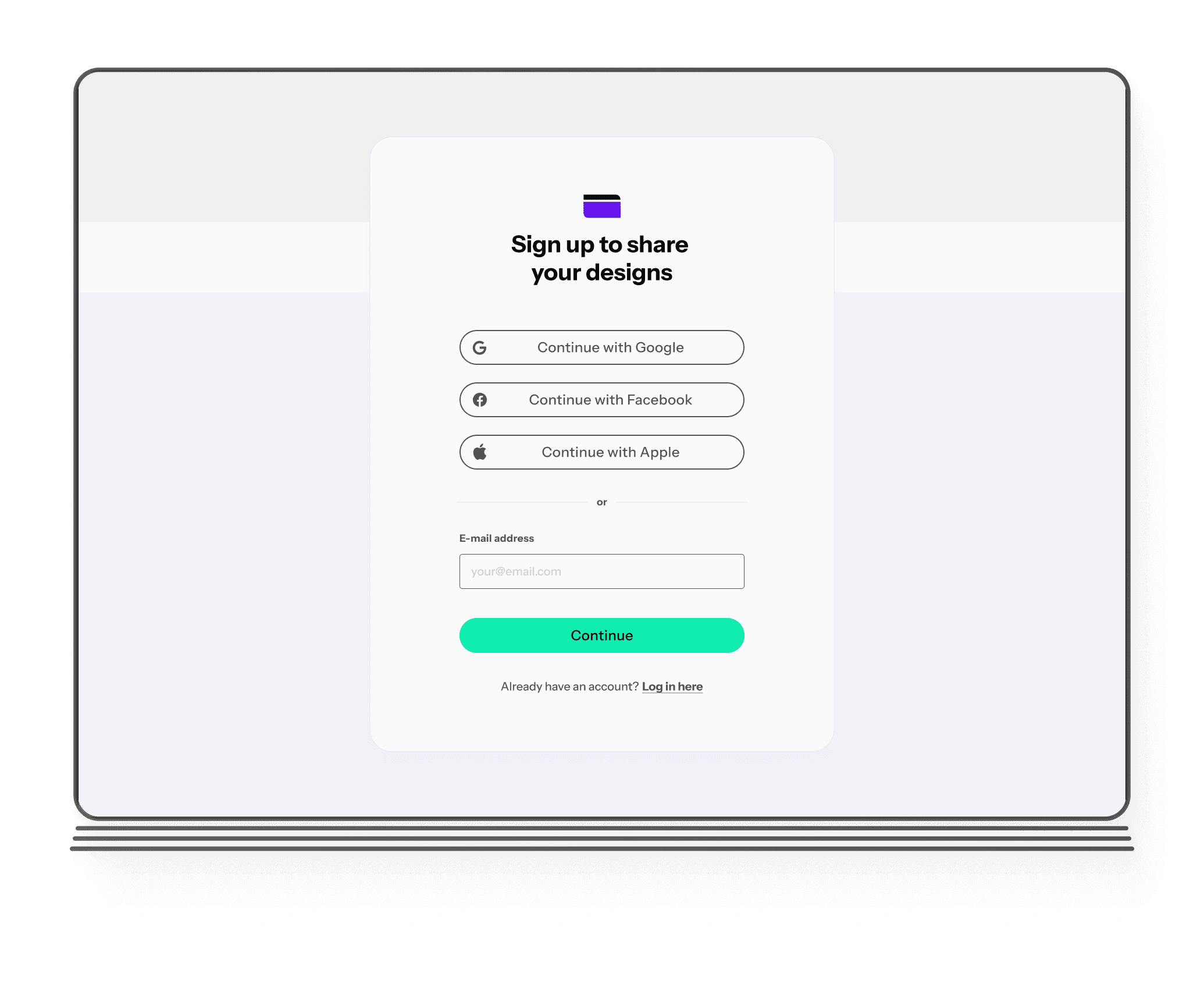
Overview
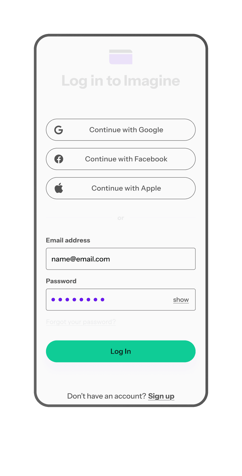
Focusing on key inputs (email, password), there are no redundant entries.
Placing input fields and buttons on the thumb zone of the screen.
Arranging adequate white space, font sizes, and touch targets
using a single-column layout.
Providing visual consistency.
Adding multiple cues - color, icons, heavy strokes, and helpful text.
Focus
Accessibility
Mobile-first
Inputs
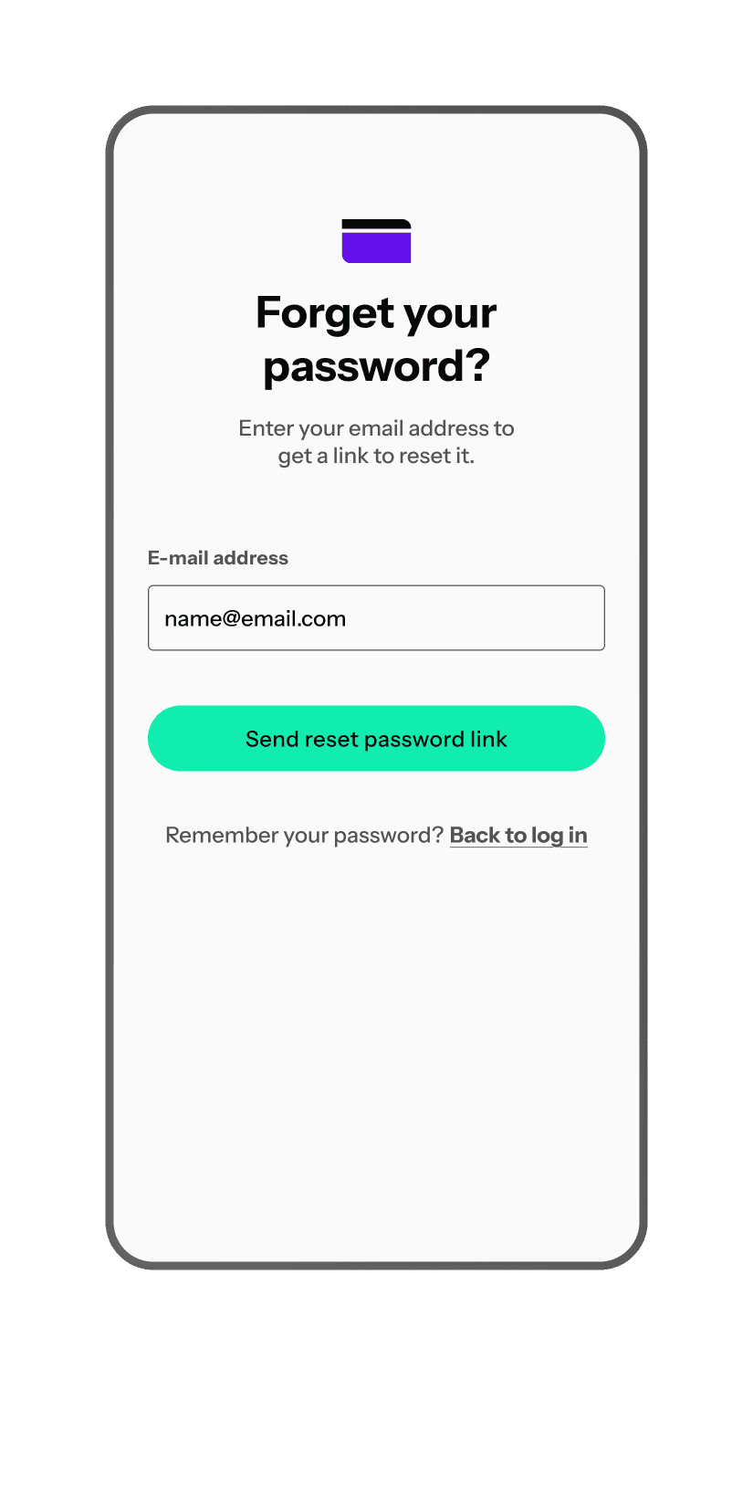
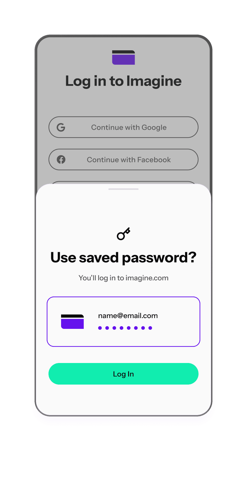
Modal
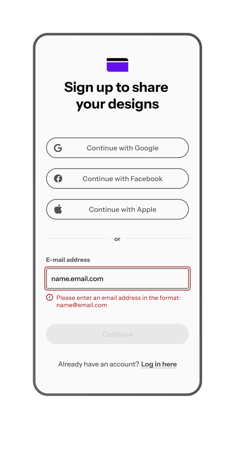
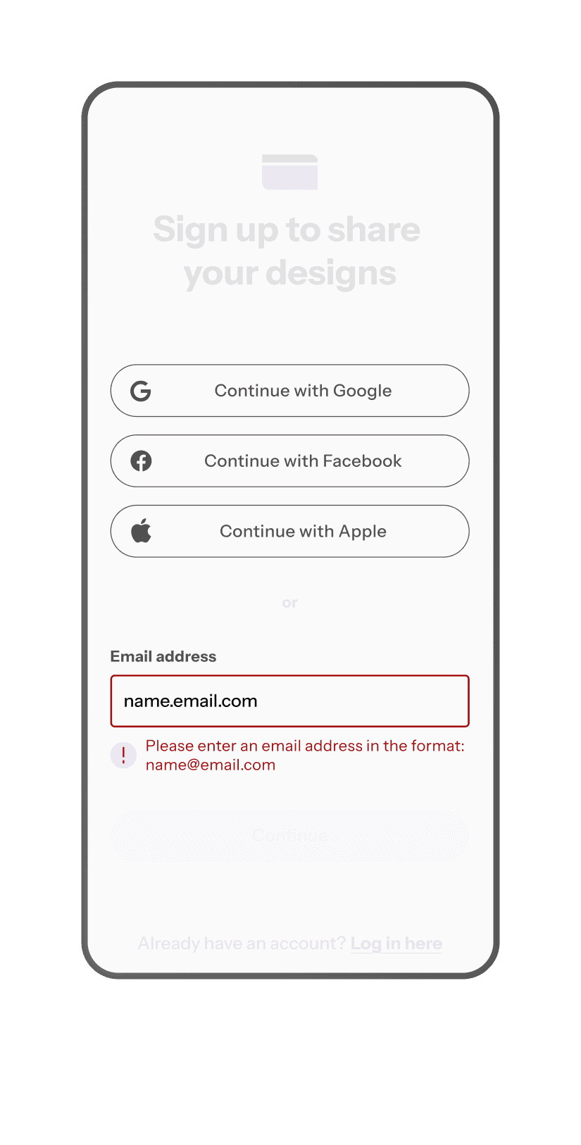
Error messages
Microcopy
Usability testing
Before and after
Tools
Figma
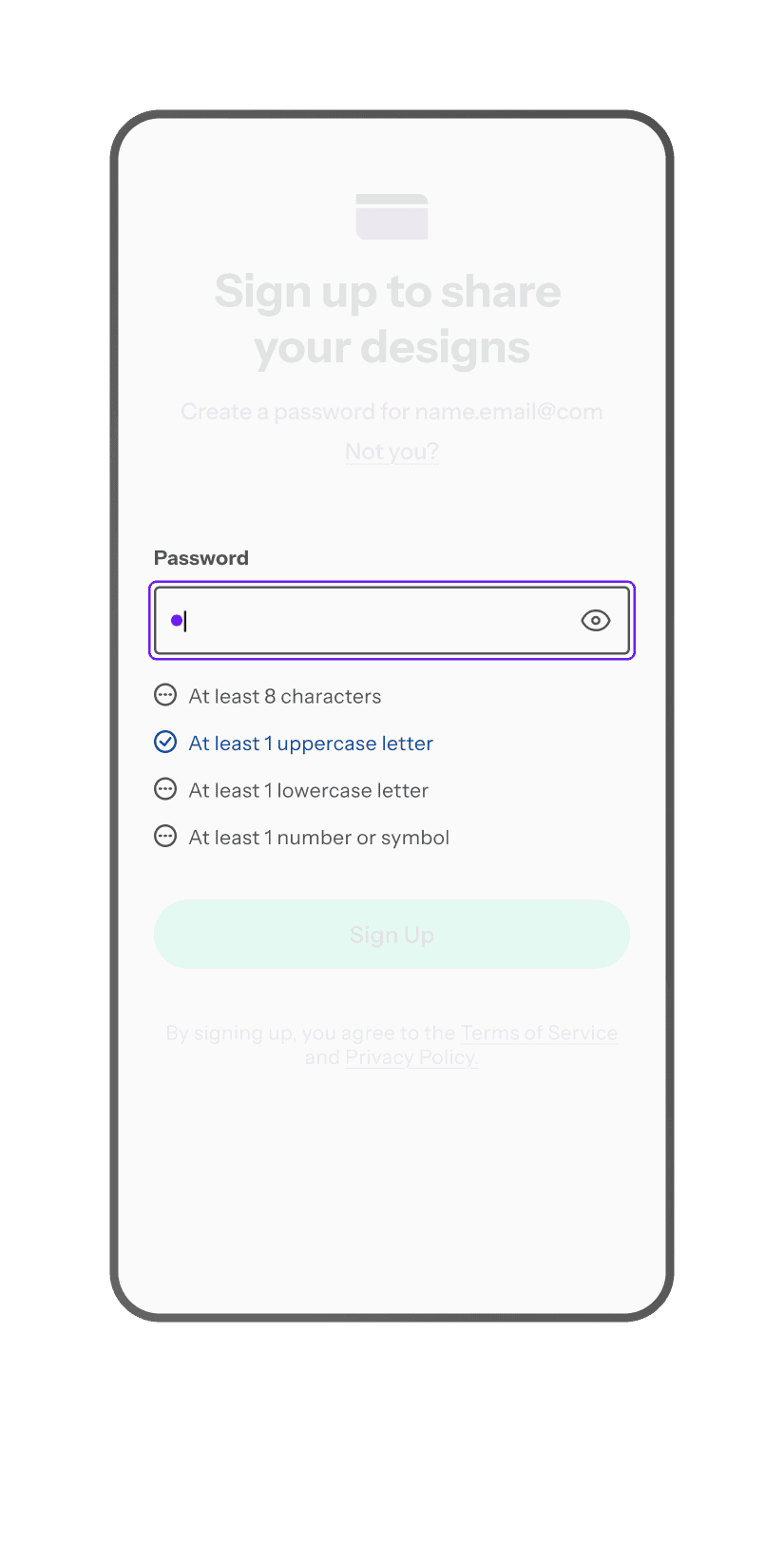
1. Spacing
Tappable/clickable area bigger than: 24 x 24 px
Button and input fields: 48 px height
16 px minimum spacing between interactive elements
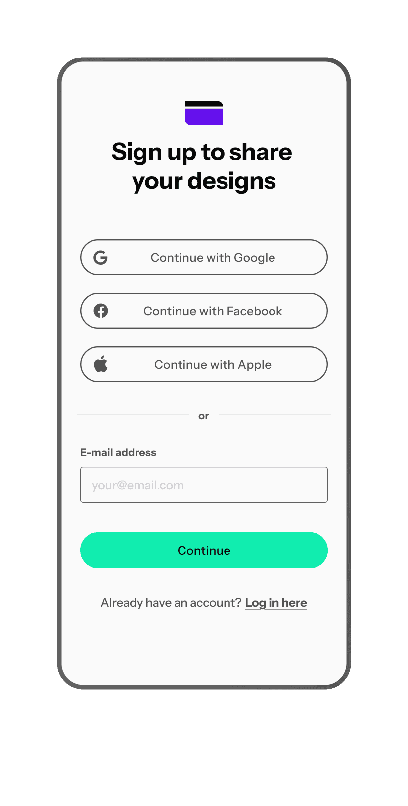

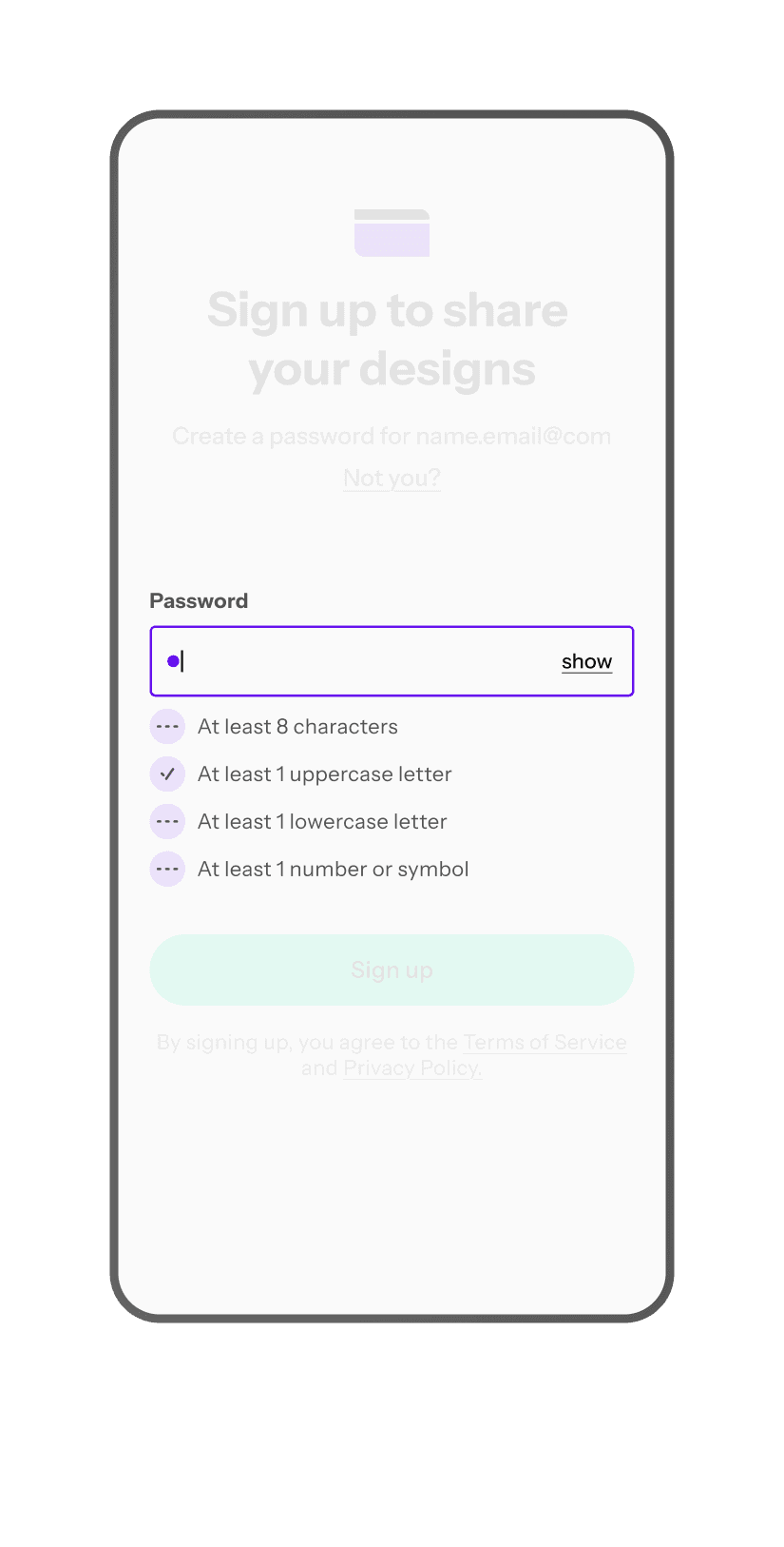
2. Labels
Clear and constantly visible
More contrasting than the placeholder text
Always outside of the input
3. Microcopy
Short and helpful microcopy
Plain language without jargon or sophisticated technical language
Explaining what has gone wrong and how to fix it
Navigating what to do next
Following a concise and delicate manner
Presenting the validation result below the input field

4. Lists
Prevent errors from occurring and help users fill out the form
5. Links
Always underlined for easier identification
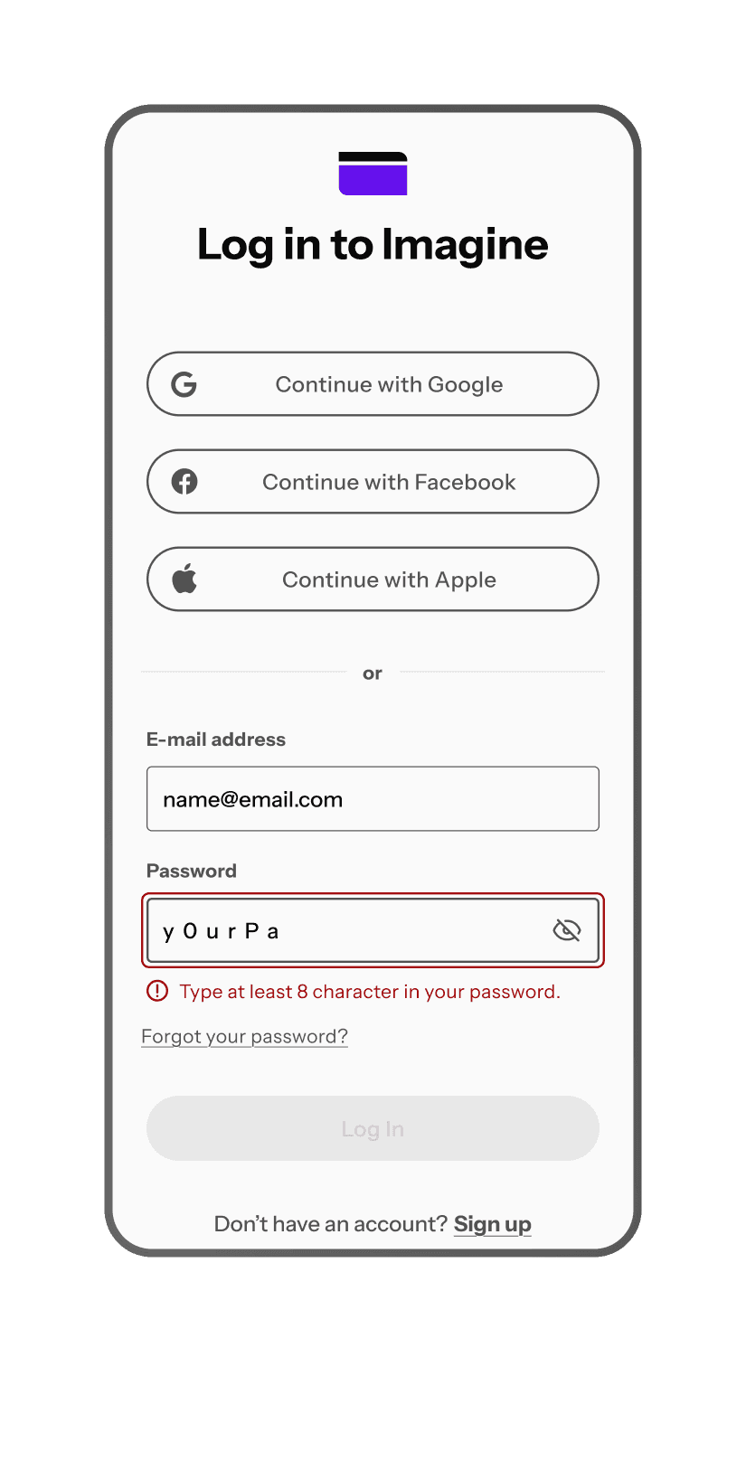
6. Colors
Sufficient color contrast ratio, bigger than 4:5:1 between text and background
The contrast between the input’s indicator (stroke) and background is bigger than 3:1, excluding inactive elements
Clear error states: red for failure, blue for success (in this case, green is a secondary brand color)
Providing other visual cues in addition to color
7. Modal
Providing an option to autocomplete to help fill form field easily
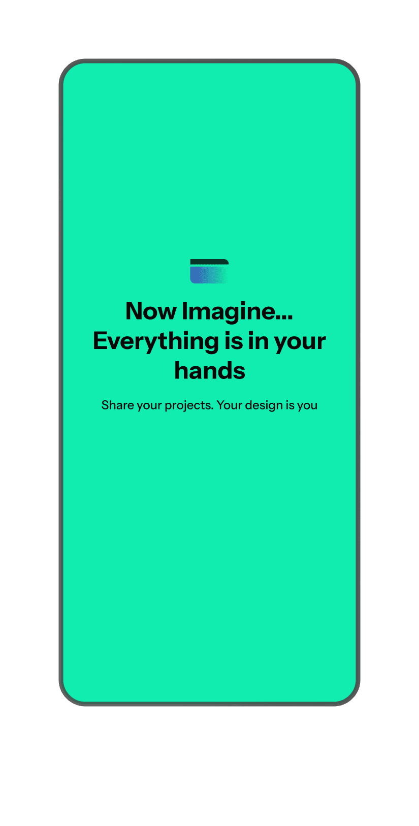
8. Happy End
9. Before Testing
These were revised screens after usability testing. What was changed:
Outlined a focus state with a relevant contrast ratio
More recognizable status icons
Spacing adjustments


To see more adjustments, check out the Figma prototype.